Covid Chart – Cases by State Partisanship
November 11, 2020
[Posted by Chuck Almdale]
This site- DanGoodSpeed.com – actually has seven charts. They move through time as the cases and deaths mount up, and the states shift position up and down the chart as they experience outbreaks. If you’re not colorblind, you can clearly see the effect that the politics of a state has on their pandemic status. Here’s a snip, frozen in time.
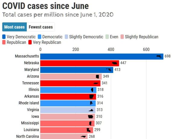
This is what it looked like on June 3. But go to the site to watch all the action. It’s not a video, but a very active chart. Controls to pause, change dates, etc. are at the bottom. No matter how much you already know about the pandemic across the USA, you’ll see it with fresh eyes.
Discover more from SANTA MONICA BAY AUDUBON SOCIETY BLOG
Subscribe to get the latest posts sent to your email.
One Comment
leave one →


This is the most interesting & easiest to follow chart I’ve seen to date. Thank you!
LikeLike